Toynbee Tiles refer to a message and a medium invented by a Philadelphia artist in the 1980’s. This site is only concerned with the work of the original artist, and the messages he’s carved into tiles, and embedded into streets in North and South America (and possibly Europe). For more on the message, explore the WHY section of this site. For more on the medium, visit HOW. For more on the evolution of styles, read on.
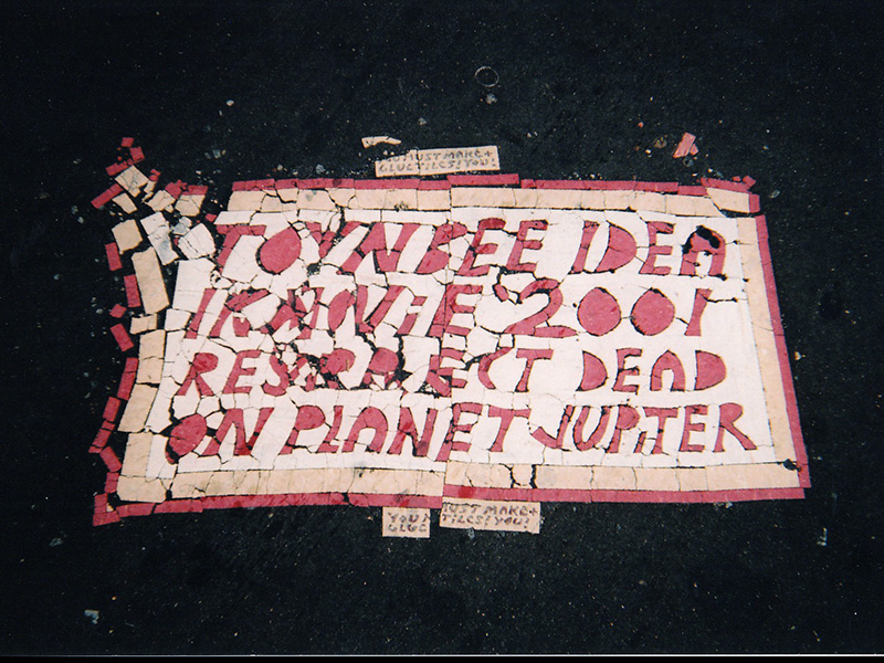
EARLIEST TILES
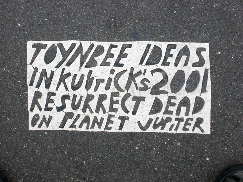
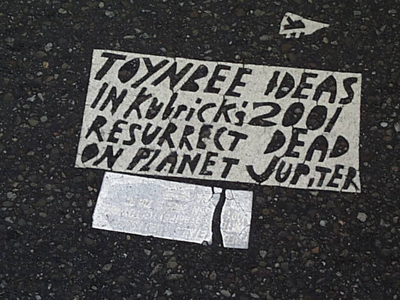
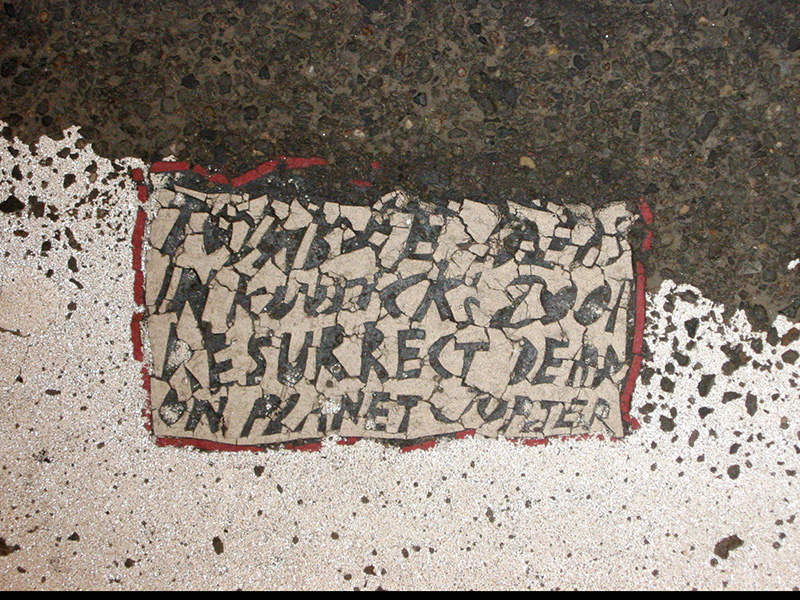
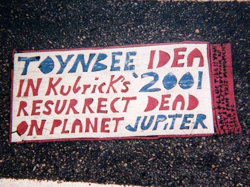
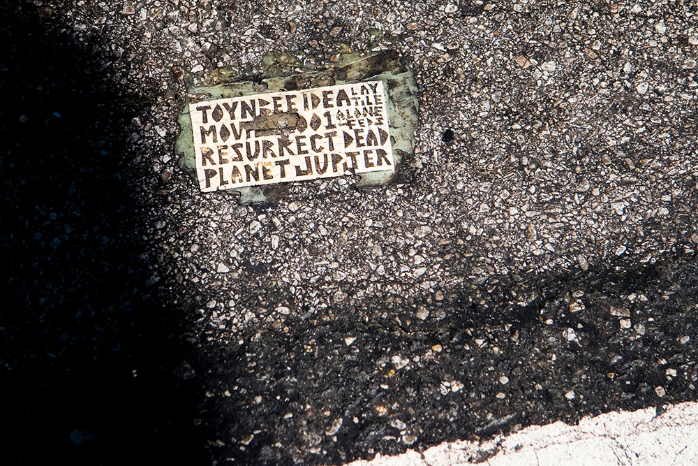
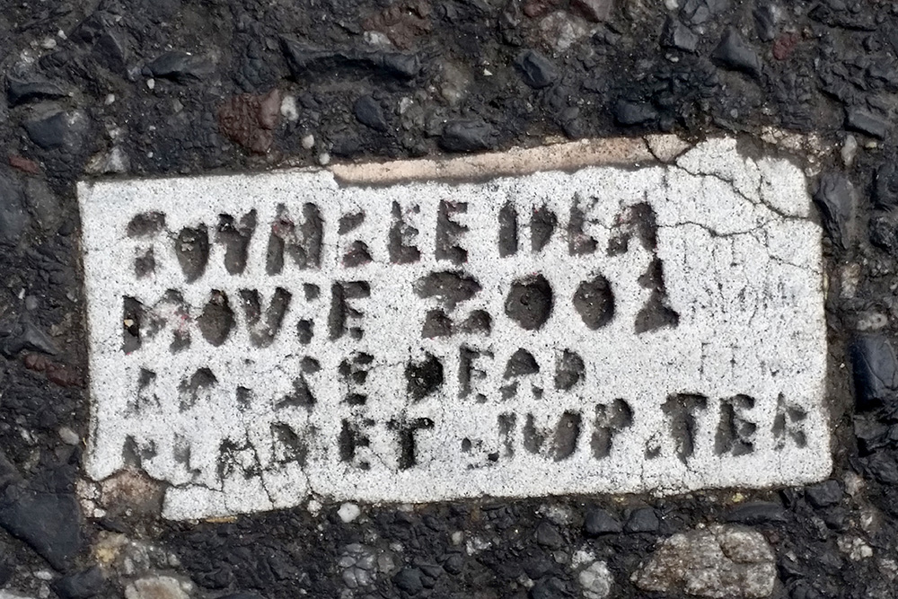
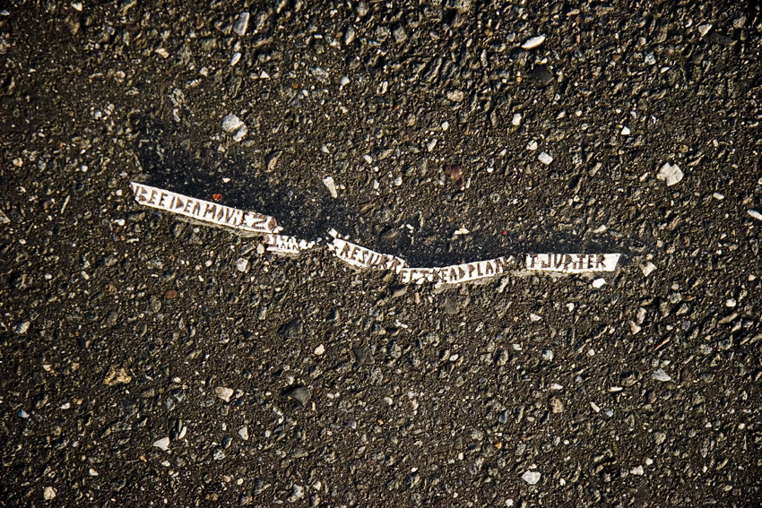
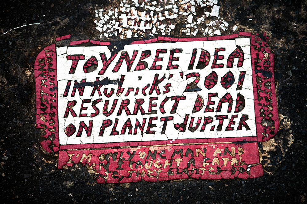
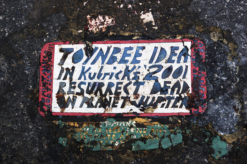
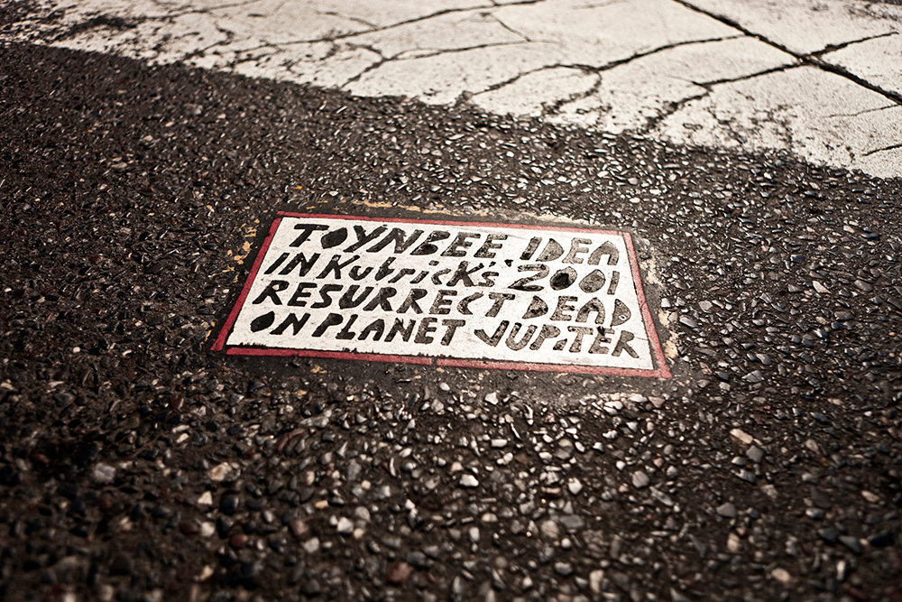
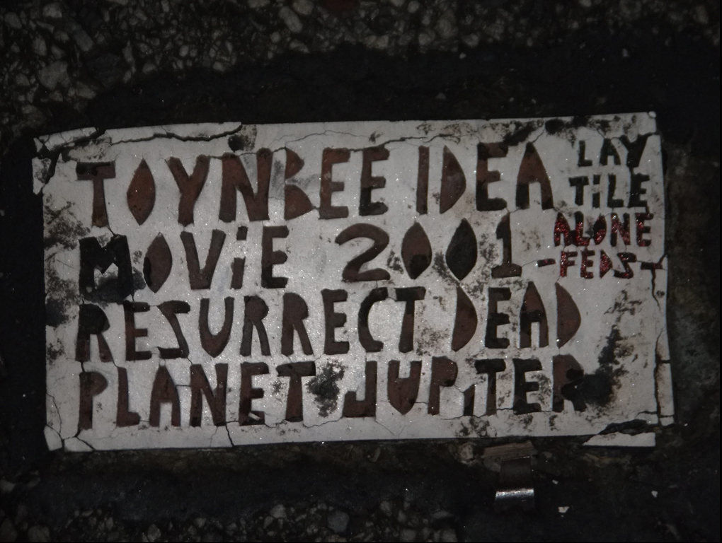
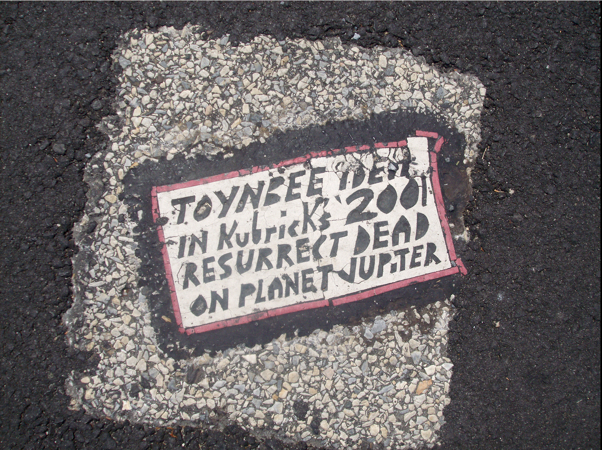
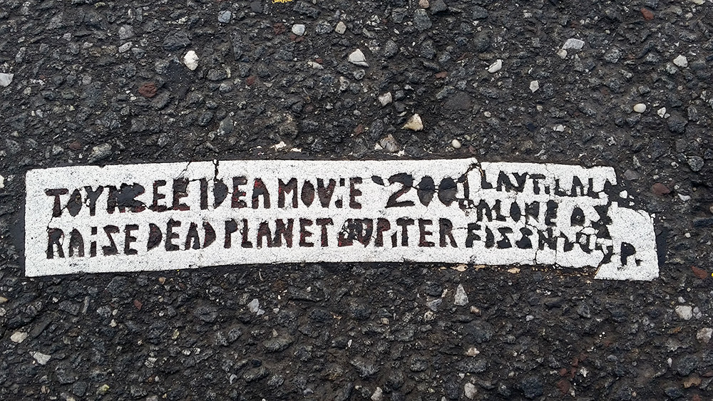
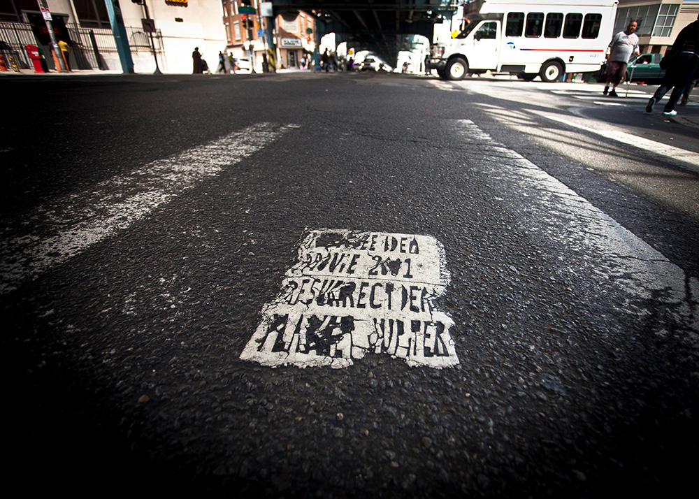
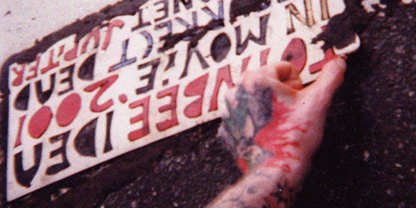
Early tiles were plain white rectangles of linoleum with the standard message:
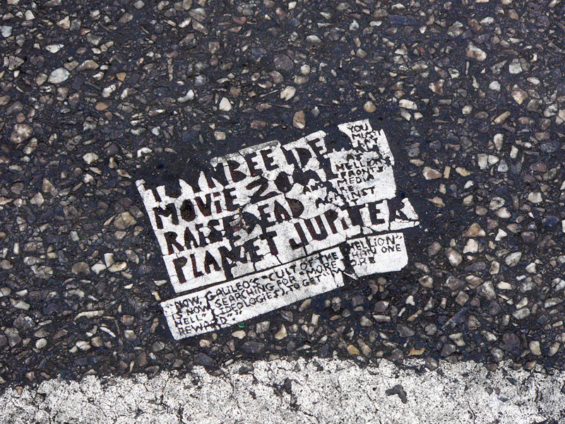
TOYNBEE IDEA IN KUBriCK’s 2001 RESURRECT DEAD ON PLANET JUPiTER
Tiles in this style appeared from the mid-1980’s through the early 1990’s in Philadelphia, Pittsburgh, Baltimore, New York, Santiago, Buenos Aires and Rio de Janiero. These tiles were about the size of a North American license plate, and with a few notable exceptions, didn’t include ancillary tiles with side-text messages. One of those exceptions is below. The Toynbee Tiler (TTT) included his home address in a “lucite block” embedded below the primary text.
Thomas and M Streets. Washington DC. Photo by Kevin Riley, 2004.
Penn Avenue, Pittsburgh, PA. Photo by Miriam Greenberg, 2001. The side-text contained the tiler’s mailing address.
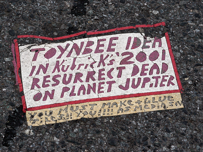
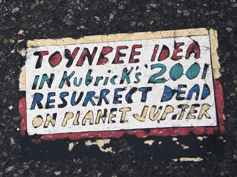
EVOLUTION
Not long after the first runs in the 1980’s, TTT began adding borders and experimenting with filling letters with color. Space for side-text also increased in design and complexity.
Temple Place & Tremont Street, Boston, MA. Photo by Kevin Riley, 2005.
Chesapeake House Rest Area, I-95, MD. Photo by Steve Weinik, 2005.
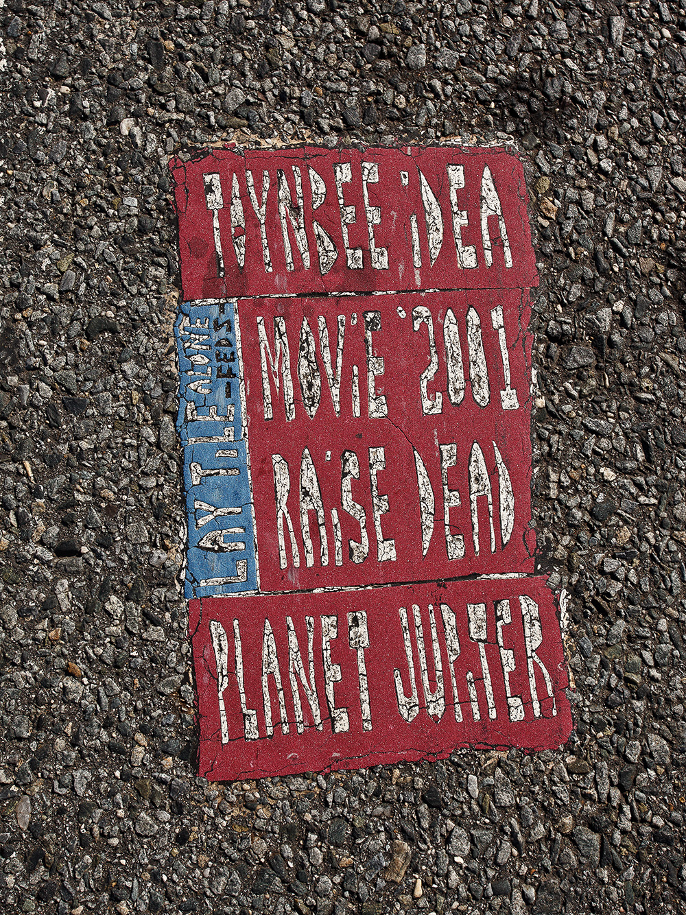
GROWING COMPLEXITY
Throughout the 1990’s, artistry and creativity continued to develop. TTT also made his first trips into the Midwest. Tiles with contrasting color mosaics, and multi-colored borders appeared.
15th and Chestnut Streets. Photo by Justin Duerr. 1997.
Menlo Park Mall, Edison, NJ. Photo by Steve Weinik, 2007.
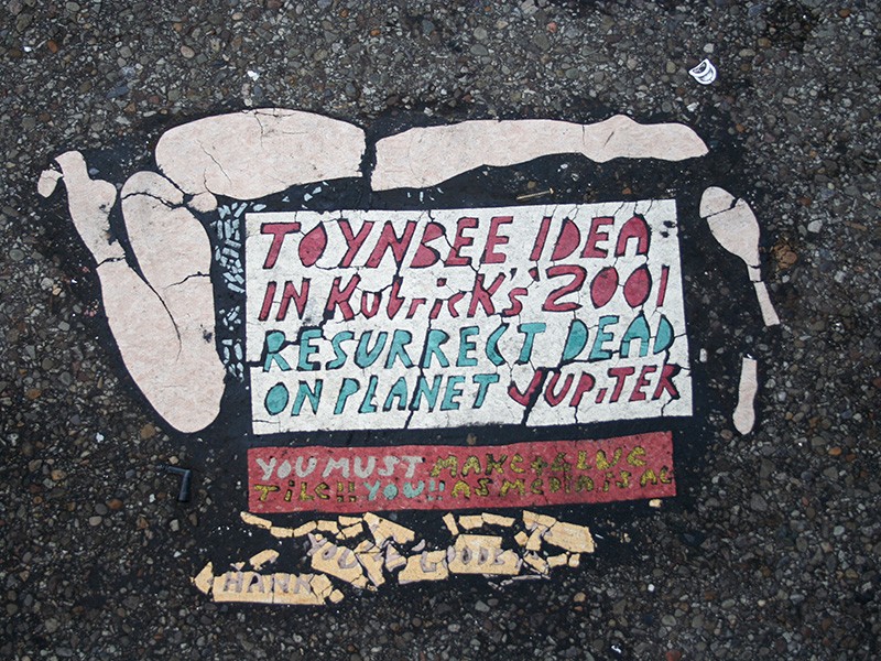
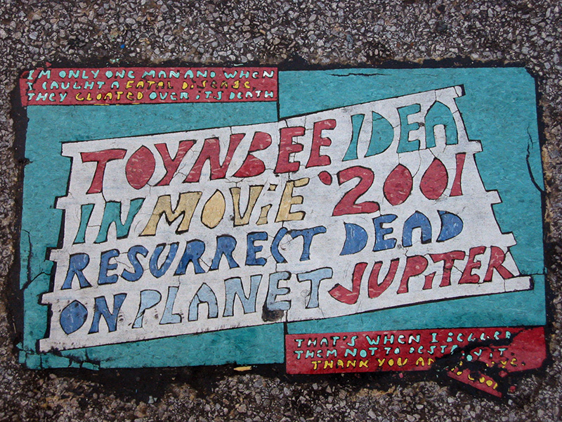
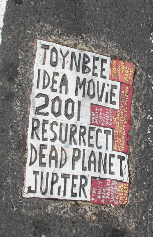
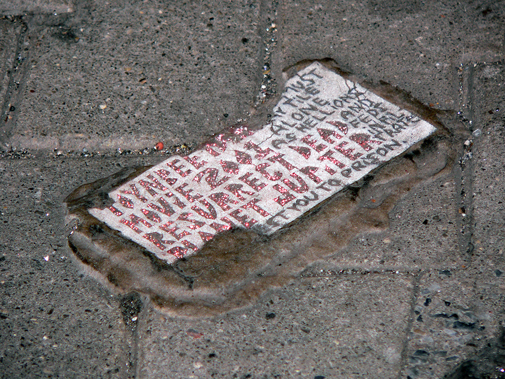
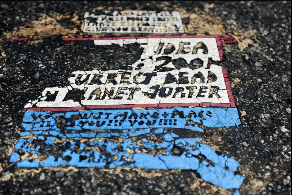
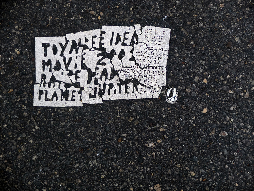
AESTHETIC PEAK
By the mid/late 1990’s Toynbee Tiles reached their aesthetic plateau. Complex mosaics, sprawling side-texts, and decorative flourishes like lady legs and coffee cups appeared as part of some designs. Contrasting double borders and double or even quadruple size tiles appeared. In some of the most complex, the segment containing the primary message was dovetailed into a larger color background.
Smithfield and Forbes, Pittsburgh, PA. Photo by Kevin Riley, 2006.
34th and 5th, New York, NY. Photo by Justin Duerr, 1998.
7th and Indiana, Washington, DC. Photo by Justin Duerr, 2006.
Michigan and Jackson, Chicago, IL. Photo by Kevin Riley, 2005.
West 3rd and Prospect, Cleveland, OH. Photo by Kevin Riley 2003.
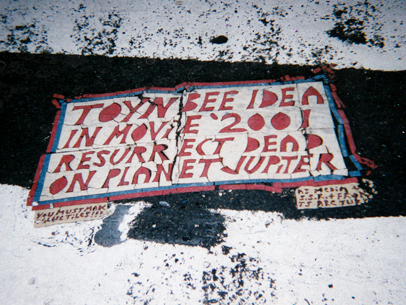
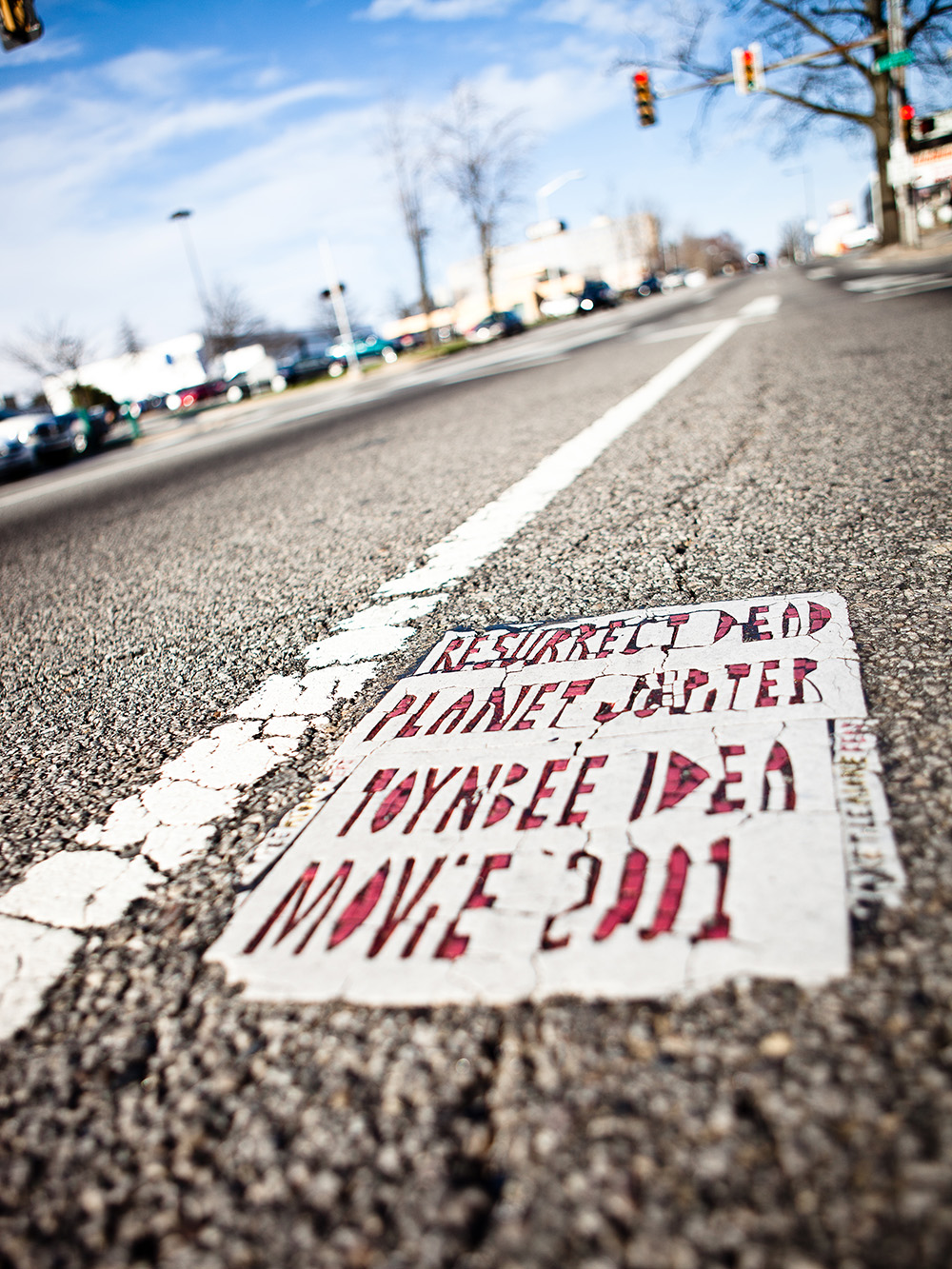
DIFFERENT DIRECTIONS: HIGHWAYS
In 2001 something happened. The steady and predictable development of the previous 2 decades took a sharp turn. The first tile in this “new style” was so different, that we assumed that it marked the retirement of TTT and the beginning of copycat movement. This is what the first of the new style tiles looked like:
13th and Chestnut, Philadelphia, PA. Photo by Justin Duerr, 2001.
What happened? If you’ll indulge some speculation, this is my theory. We know that TTT was experimenting with highway tiles around this time. Swapping the orientation vertically and stretching the letters refocuses his target audience from pedestrians to drivers. The new focus helps to explain the orientation and font changes of these new tiles.
One tile that helped convince me that these were the work of TTT and not a copycat was an early highway tile in Philadelphia. This tile, from I-676 was a clear hybrid between old and new styles:
I-676 near 22nd Street, Philadelphia. Photo by Steve Weinik 2007.
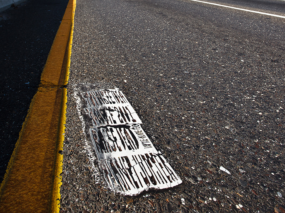
By 2002, additional highway tiles were reported in and around Philadelphia. Some were even split into several sections, glued hundreds of feet apart in sequence.
Interstate 476 near Philadelphia. Photo by Josh Weigner, 2004.
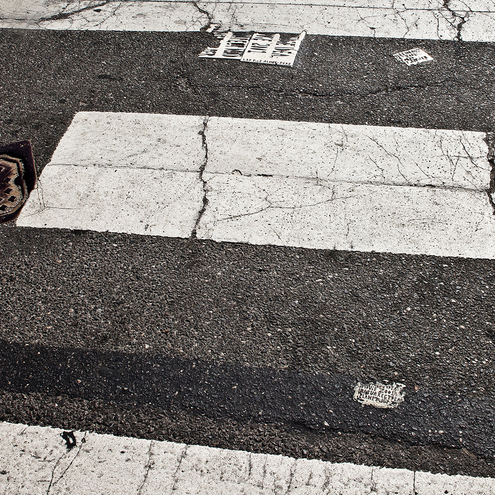
Split tiles like this one have appeared as recently as 2015. Breaking the message up also helps increase legibility at highway speed. Other styles of highway tiles have appeared on highways and larger roads around the Philadelphia metro area since 2001:
Cottman and Tooresdale, Philadelphia. Photo by Steve Weinik, 2006.
Delaware & Arctic Avenue, Atlantic City. Photo by Steve Weinik, 2014.
Cityline Avenue and 47th Street, Philadelphia, PA. Photo by Steve Weinik, 2013.
White Horse Pike & 6th Avenue, Galloway, NJ. Photo by Steve Weinik, 2013.
DIFFERENT DIRECTIONS: CITY STREETS
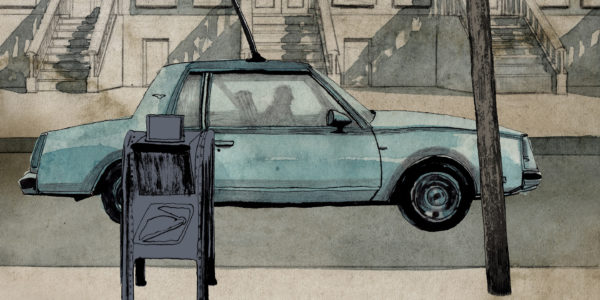
Until 2004 all tiles were distributed with the help of a car. In 2001, we saw a dramatic shift in style and location. Starting that year, and continuing to 2013, virtually no tiles were reported outside of Philadelphia and its suburbs. In 2004, we saw another big change, dozens of small “index card” style tiles spread by someone on foot. My theory is that TTT’s access to a car from 2001 – 2007 was sporadic and limited. With the exception of one post 2001 style tile found in Connecticut, none of the hundreds of reported tiles glued between 2001 – 2013 were more than an hour or so from Philadelphia.
Did the loss of a car influence the shift to smaller tiles? Did the risk of exposure alter his work? I have no idea, but it’s a decent theory. Whatever the reason, between 2004 – 2006, dozens of “index card” style tiles appeared in every corner of the city.
13th and Walnut, Philadelphia, PA. Photo by Steve Weinik, 2006.
Some of these tiles experimented with reflective paint:
Broad and Sansom, Philadelphia, PA. Photo by Steve Weinik, 2006.
Most were made of a different, more brittle material:
Location Unknown, Philadelphia, PA. Photo by Steve Weinik, 2006.
Some were tiny with the message crudely scratched in:
Broad and Hunting Park, Philadelphia, PA. Photo by Steve Weinik, 2014.
Others displayed more traditional sidebar text in adjacent mini-tiles:
Passyunk and South, Philadelphia, PA. Photo by Steve Weinik, 2006.
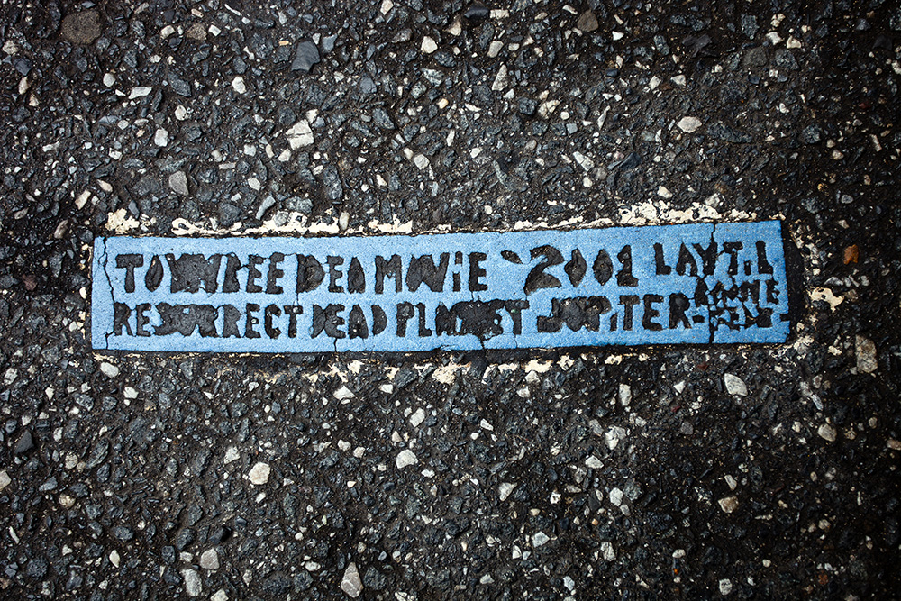
Some of my favorite from this period were the “thin strip” tiles:
8th and Oregon, Philadelphia, PA. Photo by Steve Weinik, 2006.
In the summer of 2006, jumbo size index card style tiles appeared throughout center city and University City:
15th and Vine, Philadelphia, PA. Photo by Steve Weinik, 2006.
This set of tiles at Broad and Allegheny in North Philadelphia, shows tiles from 3 separate runs. They were placed individually in separate years.
Broad and Allegheny, Philadelphia, PA. Photo by Steve Weinik, 2010.
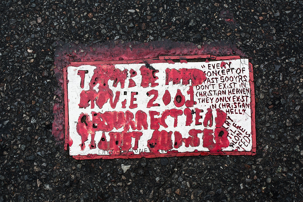
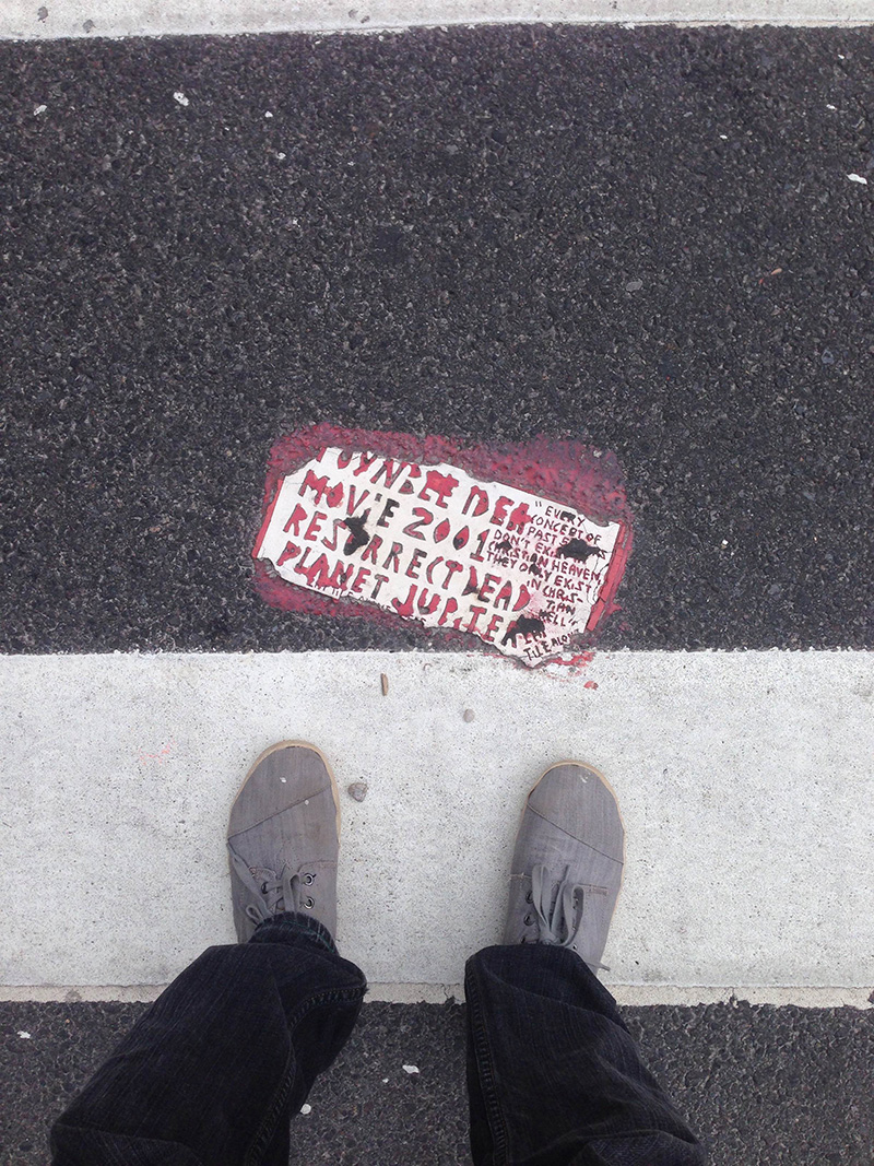
RETURN TO EARLIER STYLES
In June, 2007, a dozen large tiles close to the “original” style appeared in center city Philadelphia. These new tiles shared elements from all eras and helped shift opinion solidly in favor of a single, continuous artist. This mosaic from 16th and Chestnut Streets in Philadelphia is a mixture of original style mosaic and font with an index card style sidebar. These photos were taken very soon after the tiles were revealed.
16th and Chestnut, Philadelphia, PA. Photo by Steve Weinik, 2007.
12th and Filbert, Philadelphia, PA. Photo by Steve Weinik, 2007.
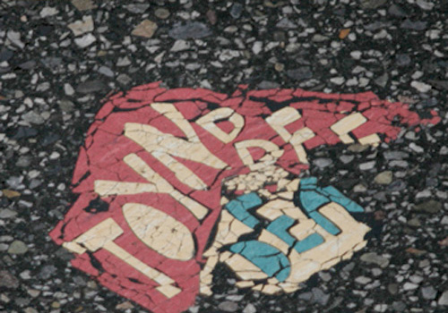
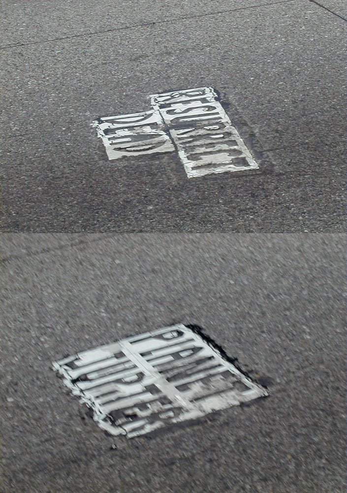
The tiles of 2007 suggested that the car was back and that the post 2001 copycat theory was probably untrue. As you can see from the condition of the tiles above, many from this run had trouble setting in the street. These tiles were generally more brittle than large 90’s era mosaics and most of them were gone within 5 years.
PROLIFERATION OF STYLE: QUANTITY OVER QUALITY
Between 2008 – 2010, more than a hundred tiles of every conceivable style (and a few new ones) were distributed across Philadelphia and South Jersey. While a handful were more elaborate, the overwhelming thrust of these runs was quantity, not quality. There are too many styles and locations to mention here, but here are a few examples:
9th and Market Philadelphia, PA. Photo by Steve Weinik, 2011.
42nd and Market, Philadelphia, PA. Photo by unknown.
Ventnor and North Franklin, Ventnor, NJ. Photo by Justin Duerr, 2012.
34th and Chestnut, Philadelphia, PA. Photo by Kendall Whitehouse, 2013.
Cottman and Oxford, Philadelphia, PA. Photo by Steve Weinik, 2014.
10th and Race, Philadelphia, PA. Photo by Steve Weinik, 2011.
Kensington and Allegheny, Philadelphia, PA. Photo by Steve Weinik, 2013.
Kensington and Wishart, Philadelphia, PA. Photo by Steve Weinik, 2013.
A BREAK?
After TTT’s 3 most prolific years, 2011 and 2012 were quiet. We don’t know if any tiles were produced in this time. While no tiles appeared, a series of handbills appeared in center city Philadelphia. They referenced a close family member of TTT, accused him of some pretty awful things, showed his picture, address, and work ID. I won’t reproduce the handbill here, but the family connection, the voice of the message and some idiosyncrasies of the text (a lower-case “i” in the word CHRiST) all suggest that TTT was behind them.
BRANCHING BACK OUT
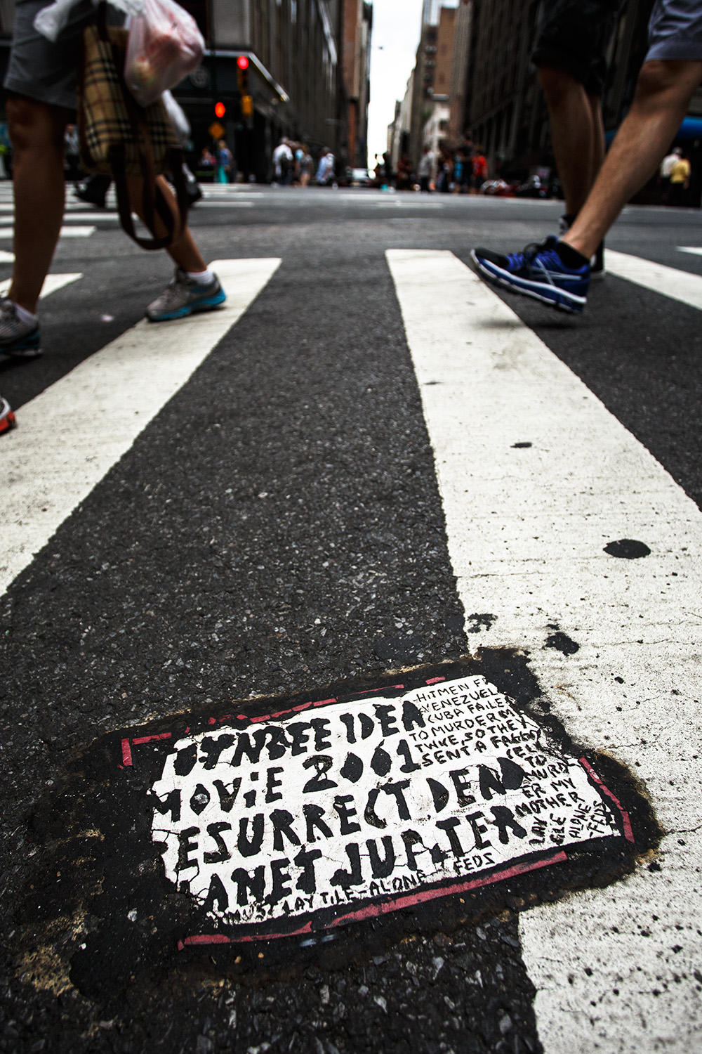
Since 2013, dozens of new tiles have appeared in Baltimore, Atlantic City, Wilmington, and New York. In 2014, I gathered reports of New York tiles and set out looking for more. Following clues from past patterns of distribution, I found 30 in a 3 hours. My walk was targeted and I’m guessing there are still dozens of others still unreported. All tiles are either a new, somewhat crude license plate size design, or highway style. Here are a few from these runs.
30th and 6th, New York, NY. Photo by Steve Weinik, 2014.
31st and 5th, New York, NY. Photo by Steve Weinik, 2014.
28th and 9th, New York, NY. Photo by RJ Rushmore, 2014.
38th and Broadway, New York, NY. Photo by Steve Weinik, 2014.
TTT remains active and has glued tiles in New York and Philadelphia in 2016. To report a tile, or to help fill in gaps where we’re missing images or have out-of-date condition information, submit your sighting here.
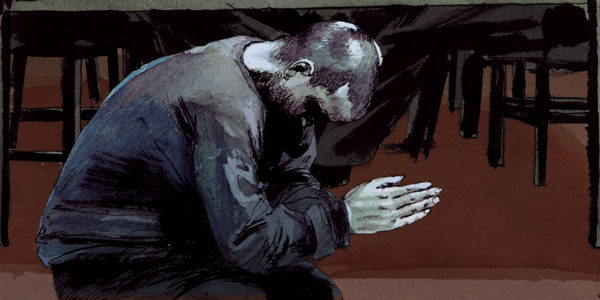
Strangeness is afoot. Most people don’t notice the hundreds of cryptic tiled messages about resurrecting the dead that have been appearing in city streets over the past three decades. But Justin Duerr does. For years, finding an answer to this long-standing urban mystery has been his obsession. He has been collecting clues that the tiler has embedded in the streets of major cities across the U.S. and South America. But as Justin starts piecing together key events of the past he finds a story that is more surreal than he imagined, and one that hits disturbingly close to home.